
Designing a content editing experience for Eventbrite Studio.

Eventbrite Studio is a customisation tool that allows event organisers to create branded event pages that help them connect with their audiences.
Problem statement
Event creator's are confused by having to edit their content in multiple places across the Eventbrite platform. How might we make it easier for creators to manage their content directly inside Studio so they can see their content changes in real time?
User stories
I worked with the PM to establish some user stories to help frame the problem and begin the ideation and discovery phase.
As a user, I need to be able to add, edit and remove page specific content such as speakers, sponsors etc.
As a user, I need to be able to navigate easily between the event listings page and event details pages and have it clear to me which page I am currently editing.
As a user, I need more clarity around what is editable and where I can find this function
Divergent Designs
Wireframes & Ideation
I spent some time quickly sketching on a whiteboard some potential solutions and later developed these into quick prototypes to test interactions and the user flow. EDS (Eventbrite's Design System) allowed me to quickly mock up screens in Figma that I could later present to the team. By the end of the week I had 3-4 different solutions to share with the engineers and prep for user testing.

Using Eventbrite's Design System to quickly mockup a few different solutions; editing via a sidebar, inline editing, improved pages navigation and information architecture

This was a divergent phase that took a week to explore as many solutions as possible to later present to the team
Involving engineering for initial feedback
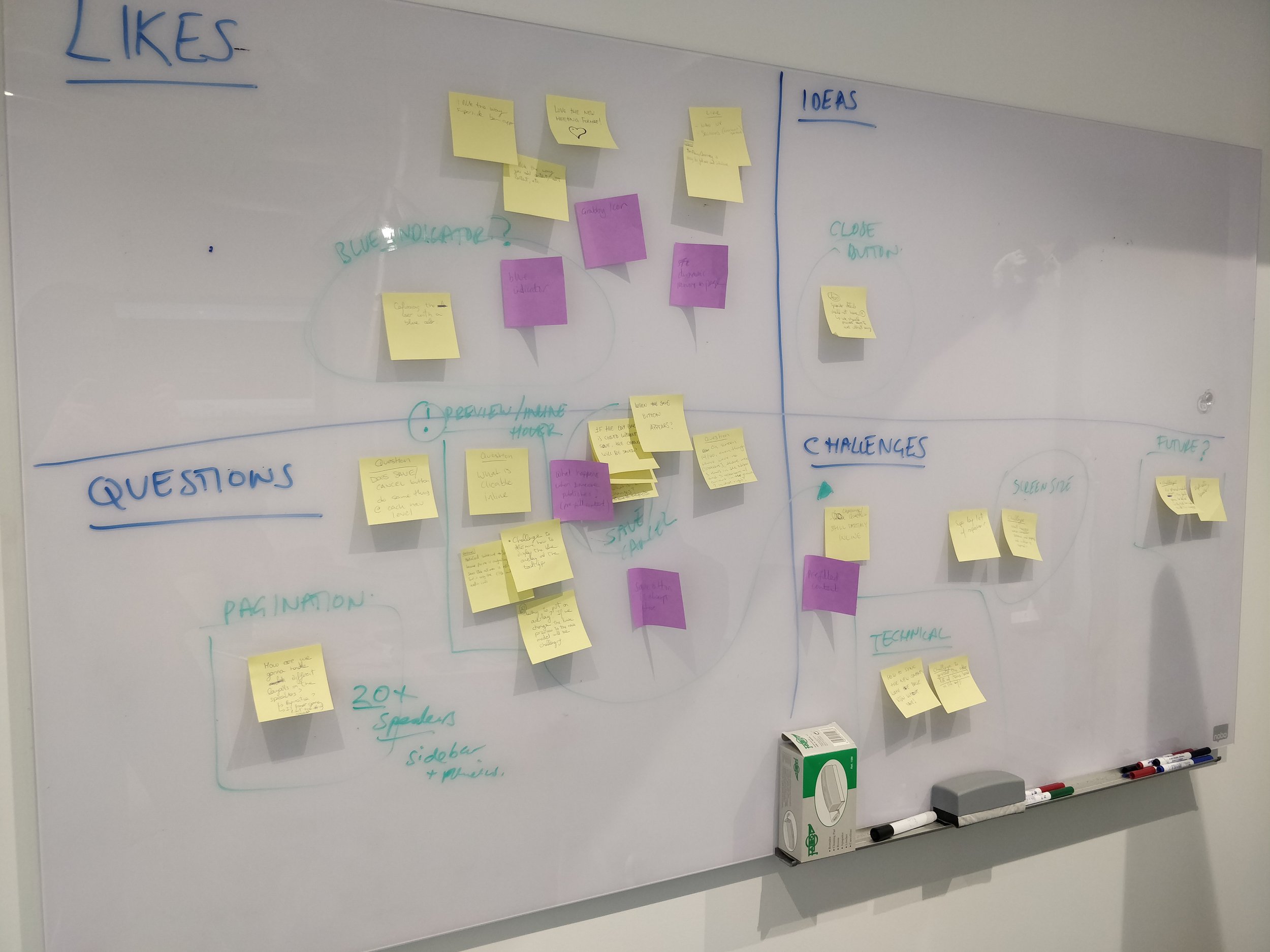
Once I had 3-4 solutions ready, I brought them to the weekly Design Office Hours where I talked through the different options. I wanted to use this time to understand technical limitations, concerns, new ideas or any questions they had. Using a whiteboard and a matrix we captured the teams likes, challenges, questions and ideas. This helped guide the conversation and keep the team focused on the problem at hand. At the end of the session we grouped the different feedback and I noted some action items for my next round of iterations.
By the end of the session we had narrowed it down to two strong contenders that I was ready to prep for user testing.
Convergent designs
The feedback session was helpful for me to understand where to direct my efforts and prepare for user testing. We landed with two strong solutions but we still had more work to do to understand the cost/benefit of building each solution.
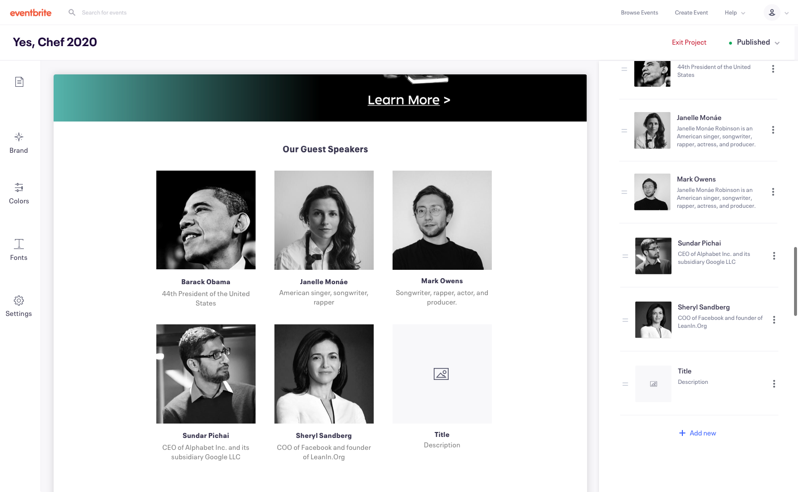
Solution 1: The ‘Super Sidebar’
The "super sidebar” allows users to open a side panel where they can add, edit and organise new content modules all in one place.
Pros:
Much easier and quicker for the engineers to implement
Much lower investment as an 'MVP' to test first on enterprise users before rolling out to SSO
Consistent with the rest of the EB core product (as of today)
Less risk and easier to iterate later, after knowing how customisation will play out as a whole across EB. / Conduct more research on our users
Better supports structured content
Cons:
Potentially need two sidebars or a clear way to differentiate between global and page specific editing
Potentially harder to use than inline (navigating to the content panel and correlating between live preview and input fields) - this could be mitigated with the user of hover states and overlays.
Solution 2: Inline editing
Inline editing allows the user to edit the content directly in the preview

Pros:
Modern & intuitive way of editing content
Familiar patterns for users based on other popular website builders (Squarespace, Shopify, etc.)
Easy for the user to discover and quick for them to make changes
Cons:
A huge engineering effort to support this functionality - cost/benefit is not clear.
We assume it's a better experience for the user, but have no data to prove this yet
Inconsistent with rest of EB content editing experience (e.g email campaigns etc.)
Remote usability testing for rapid feedback
After I had two strong proposals, I created a test plan to compare the two designs against each other to see which performed better.
Our hypothesis in the team feedback session where largely correct. Both solutions where sound but inline editing performed marginally better. We decided this wasn't a strong enough indicator to move forward with inline editing given the engineering lift it would take to get it into production.
Some other insights we learnt:
50% of users are missing validation that their changes had been applied. We should consider this when introducing additional editable modules to add a "save" button that offers reassurance.
40% of users found the inconsistency between editing experiences (half inline/half sidebar) frustrating and confusing. The recommendation would be to move completely inline, or sidebar, but not both simultaneously.
30% of users were unsure how to find a way to discover their additional event pages. We should introduce breadcrumbs and allow better navigation between pages
Hi-fidelity Prototypes & Hand Off
After sharing the user testing feedback with the team, we felt confident to move forward with the super sidebar as 90% of users could successfully complete all the tasks required and it would be much quicker to implement.

Adding a speaker section

Editing a speaker profile

Scrolling sidebar

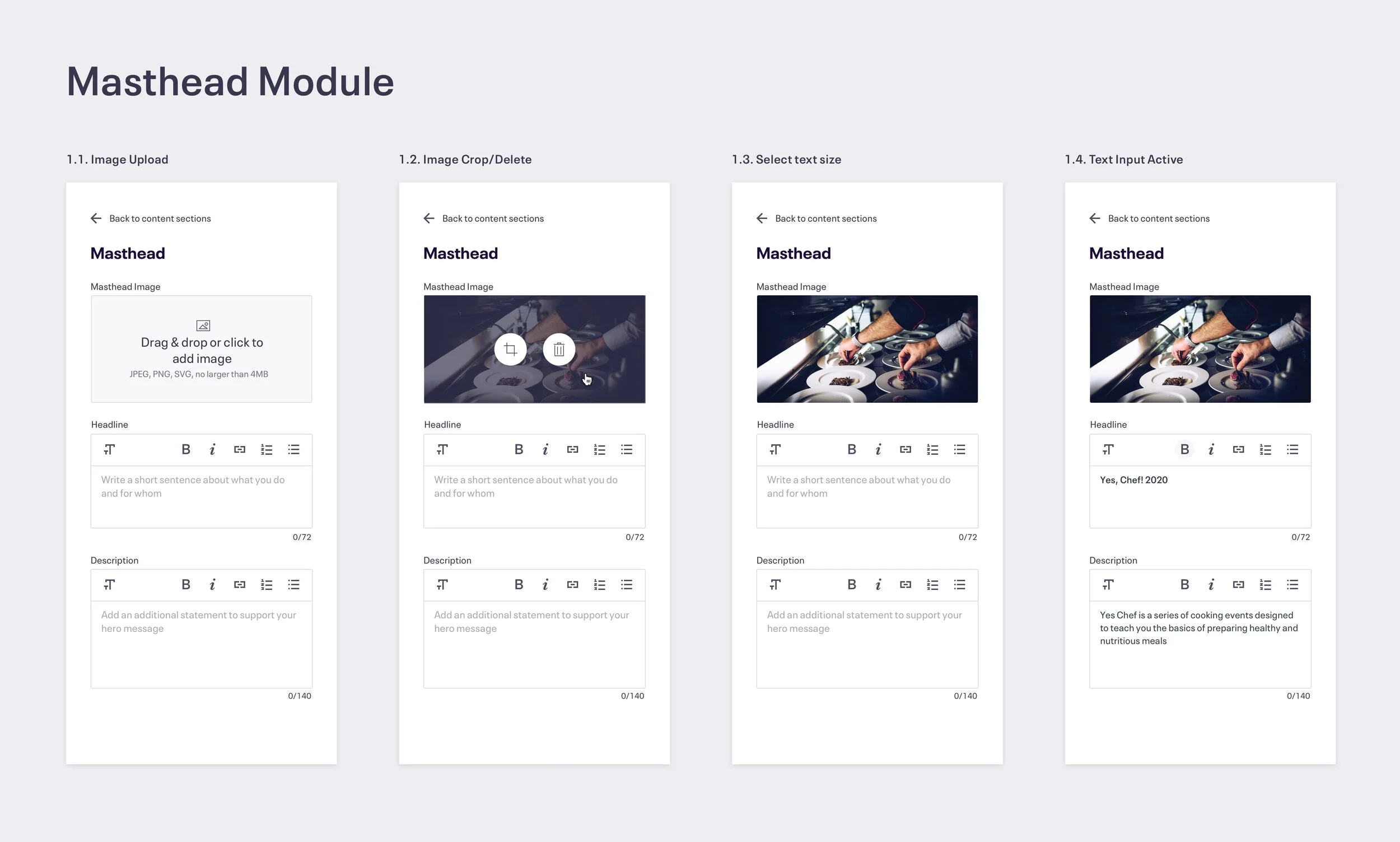
Different states for the masthead module
See it in action
www.eventbrite.com/studio
